Live class attendance, measured honestly
A join-to-leave span is not attendance, and the scheduled hour is not the denominator. What an honest live-class register actually measures — and why what you taught belongs on the same row.
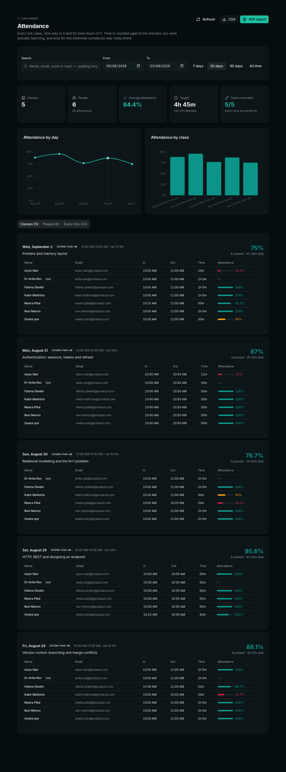
Every teacher who has run a live class online has been asked a version of the same question, usually by somebody who was not in the room. A parent asks whether their daughter actually attends. A student contests a detention. A funder wants to know what their sponsorship bought. An internship coordinator wants to know who is still turning up in week six. The question is always the same shape — how much of this class did this person attend, and what was it about — and for most teachers the answer lives in memory, a WhatsApp thread, and a screenshot of the participant list taken on a good day.
The obvious fix is to have the software count it. That is where the trouble starts, because attendance in a live class is deceptively easy to compute badly, and a number computed badly is worse than no number at all: it looks defensible right up until somebody checks it.
What an attendance record has to survive
Before deciding what to measure, it is worth being honest about who reads the result. An attendance figure is not a dashboard metric that lives and dies inside your own head. It gets forwarded. In practice it has to survive four different readers, each of whom will attack it from a different angle:
- The student who disagrees. They will say they were there. If your record cannot show when they joined, when they left, and whether they came back, you have no answer beyond your recollection.
- The parent who is paying. They want a pattern, not a day: is she attending, roughly, most of the time, and is it getting better or worse.
- The institution or funder. They want totals across a cohort and a range, in a file, with names and email addresses that match their own list.
- You, six weeks later, deciding whether to award a certificate. This is the reader everyone forgets, and the one who most needs to know what each class was actually about.
Every design decision below follows from that list. Nothing here is about a prettier chart; it is about a number that holds up when it is challenged.
Mistake one: a span is not attendance
The easiest thing to record about a participant is when they first appeared and when they were last seen. Subtract one from the other and you have a duration. It is one line of code and it is wrong more often than people expect.
Consider a student who joins at 10:00, realises they have the wrong link open, leaves at 10:05, gets distracted, and comes back at 10:55 for the last five minutes of a one-hour class. First seen 10:00, last seen 11:00. Measured as a span, that is sixty minutes and a perfect attendance record. Measured honestly, it is ten minutes.
So presence has to be accumulated as stretches, not as a span. Each stretch opens when somebody arrives, extends while they are still being seen, and closes when they actually leave. A return opens a new one. The time credited is the sum of the stretches; the gap between them is nobody's class time.
This has a pleasant side effect: because the stretches are kept, the report can say how many times somebody rejoined. One rejoin is a dropped connection. Five is a student who is not really in the room, and it is worth knowing which is which before you write to them.
A practical detail
The host's browser reports the room roughly every 45 seconds, and immediately whenever somebody joins or leaves. So a gap of a couple of minutes between sightings is a slow tick, and anything longer is a genuine absence. Draw that line somewhere explicit rather than leaving it to chance — we treat anything beyond two and a half minutes as a real gap, and close the stretch.
Mistake two: the scheduled hour is not the denominator
The second mistake is quieter and does more damage. A percentage needs a denominator, and the obvious one is the class length you scheduled. But scheduled classes routinely do not run to their scheduled length. You start eight minutes late because the previous session overran. You finish early because the material ran out. You cancel the last twenty minutes because half the cohort is sitting an exam.
Measure against the sixty minutes you booked and a class that actually ran thirty-two reports a full, attentive room at 53% — and every one of those students has a permanent record saying they missed nearly half of something they did not miss.
The defensible denominator is the time the teacher was in the room, because that is when the class existed. If you were not there, it was not class. It also handles the awkward case honestly: if your own connection drops for twenty minutes and comes back, the class is the union of the stretches you were present for — not the span from your first login to your last goodbye. Nobody should be marked absent from twenty minutes during which nothing was being taught.
When there is no host on record
Occasionally a room runs without a recognised host — a co-teacher opened it, or the roster only ever saw students. Rather than silently substituting something else, the class is labelled as having an estimated length, so a reader knows which figure to trust less. A quietly-guessed denominator is exactly the sort of thing that gets discovered in an appeal.
Mistake three: the register only knows people who signed in
The third gap is not arithmetic at all. A great many people join a live class by opening the link somebody sent them. They never signed into the platform, they may not have an account, and any attendance mechanism that runs inside the student's app never hears from them. For an internship cohort or an open workshop, that can be most of the room.
The fix is to make the host the recorder. The teacher's browser is the one participant that can see the entire room, including anonymous guests, and the name and email each person supplied on the way in ride along with them. So the register is written from the host's view of the room, once a minute, for everyone in it — signed in or not. It means a workshop attendee who joined from a forwarded link still lands in the record with a reachable email address next to their name.
What it looks like when all three are fixed
The tiles are the answer to “how is this cohort doing” in one line: how many classes ran, how many distinct people attended anything, the average attendance across every line, how long you actually taught for, and — the one nobody expects — how many of those classes have a topic recorded against them.
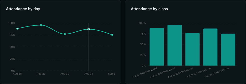
Two charts, because they answer different questions. The day line is for the pattern — is this cohort drifting, did something change after the mid-term. The per-class bars are for the outlier: one bar noticeably shorter than its neighbours is a class worth thinking about, and because the topic is recorded you can see immediately whether the room emptied during the database session or during the one you ran at 8am on a Saturday.
One class, one line per person
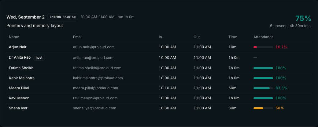
This is the view that settles an argument. Not a percentage on its own — a percentage with the times that produced it, so a student who says “I was there” can be shown that they were, for half of it, from half past. Where somebody left and came back, the row says so, with the number of rejoins next to the minutes.
The column nobody stores: what you actually taught
Here is a thing worth pausing on. Nearly every tool that records attendance in a live class records the room, the date, the people and the duration. Almost none record what the class was about.
That sounds like a nicety until you look at what an attendance record is used for. “Ravi attended 47 of 52 minutes on 3 September” is not, on its own, evidence of anything. Forty-seven minutes of what? The answer sits in the teacher's head, and by the time somebody asks — a certificate decision, a parent meeting, an audit of a sponsored programme — the head has moved on to next term.
The reason it usually is not stored is that people assume it already is. The scheduled session has a title, so surely that is the topic. But the title is the name of the recurring room — “Full-Stack Internship · Batch 45” — and it is identical for all forty-five sessions. Planning boards have topic cards, but a card is an intention: what somebody meant to cover, on a board, not what actually happened in Tuesday's class after the first twenty minutes went on questions about last week's assignment.
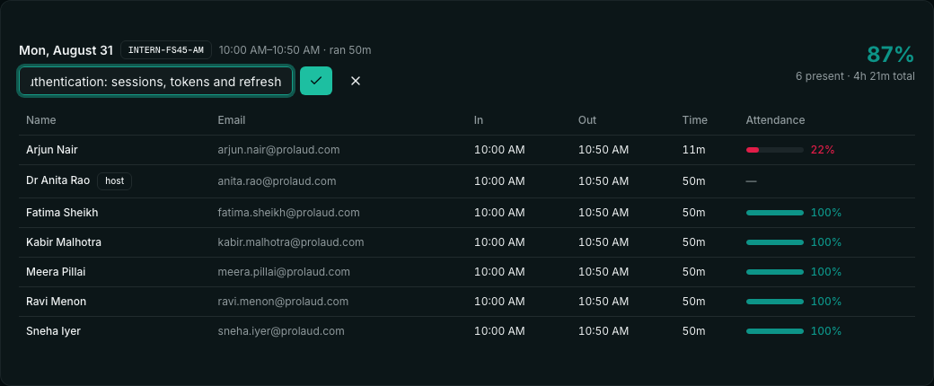
So it gets its own row in its own table, keyed by room and date — one topic per class occurrence, edited in place, rewritable when the wording is wrong. Deliberately not attached to the scheduled session, because a recurring room has one session record and forty-five different lessons.
Where it earns its place is on every line downstream. The topic rides on each attendance row, into the CSV, into the PDF. It also becomes searchable: typing “pointers” finds the class about pointers and everybody who was in it, which is a genuinely useful thing to be able to ask a register.
Count what is missing, out loud
A field nobody is forced to fill in will be empty most of the time, and an empty field that nothing complains about stays empty forever. So the summary counts classes with no topic recorded and says so on the screen — 4 of 5, not a quiet blank. An attendance line with no topic cannot answer the question it will eventually be asked.
Finding one student among four hundred
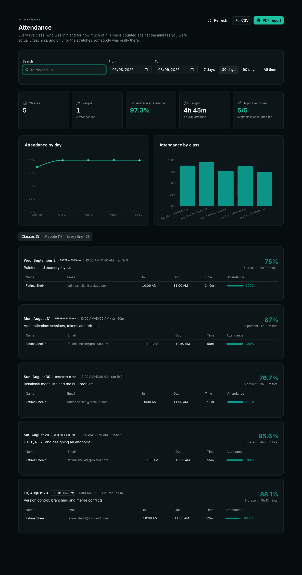
Search on an attendance register has a failure mode worth naming: when a search for a misspelt name returns nothing, it does not read as “you spelled it wrong”. It reads as “she never came to class”. Teachers type quickly, and names transliterated from another script have several plausible spellings — Sheikh, Shaikh, Shiekh — none of which is a typo exactly.
So the search is deliberately forgiving. It matches on exact text first, then prefixes, then per-word with a tolerance for a character or two out of place, and finally on the letters in order — so “dstr” finds “Data Structures”. It searches names, email addresses, room codes and the topic taught, and it narrows the charts along with the table, so what you are looking at and what the numbers say cannot disagree.
The filters are in the URL, which sounds like a technicality and is not: a teacher who has narrowed to one room and one week can send that link to a head of department, and they will open exactly the view that was described to them.
Exports that match what you were looking at
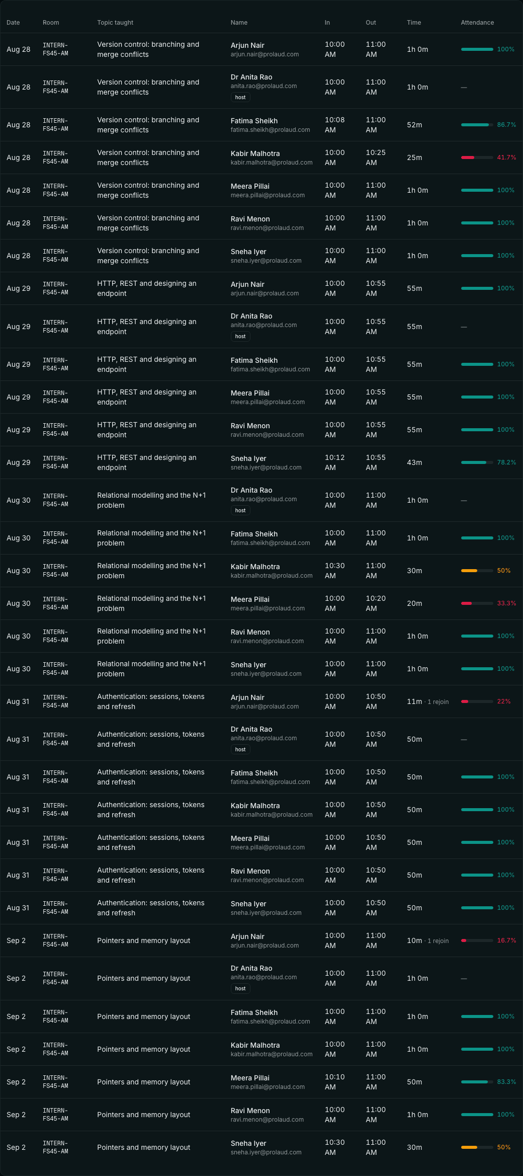
Two exports, and one rule about both: they obey the same filters as the screen. An export that quietly ignores the search box is how somebody emails a spreadsheet of the wrong cohort to a funder, and does not find out for a month.
The CSV is the one that goes into somebody else's system — one row per attendance line, with the topic, the join and leave times, the minutes and the percentage. The PDF is the one that goes to a human: the charts, a table of classes with what was taught in each, a table of students, and every line underneath.
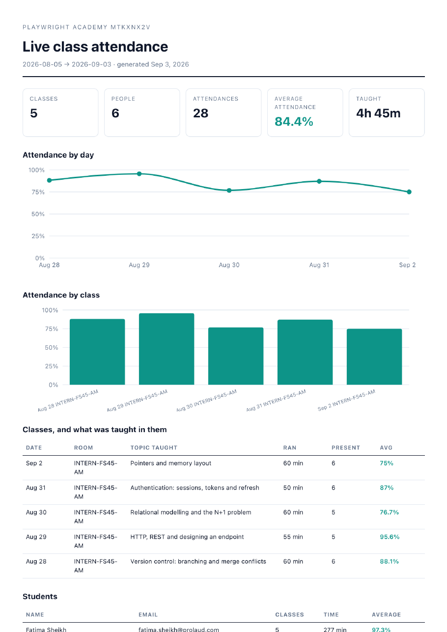
One detail in that PDF is worth copying whatever tool you use: the footer says how the numbers were arrived at. “Attendance is measured against the time the teacher was in the room, and counts only the stretches a person was actually present.” A report that states its own method can be argued with. A report that just shows 17% invites the reader to assume the worst about either the student or the software.
What we deliberately did not build
There is a category of live-class analytics that measures whether a student's tab was in focus, whether their camera was on, whether their mouse moved. It is technically straightforward and we are not going to do it.
Partly because it is wrong about people — a student listening carefully on a phone while walking is not disengaged, and a student with a camera pointed at a wall may be the most attentive person in the room. Partly because it is wrong about bandwidth: in most of the cohorts we see, cameras off is the difference between attending and not attending at all. And partly because a number that cannot be shown to the person it describes without embarrassment is not a number worth collecting.
Time present, honestly measured, is a defensible thing to record. Attention, inferred from a browser, is not.
Running this in your own classes
- Use one room per cohort and let it repeat. The register keys on room plus date, so a recurring room gives you one clean row per day rather than a pile of one-off sessions to reconcile.
- Open the room yourself, and stay in it. Your presence is the denominator; a class you dial into ten minutes late is a class that is ten minutes shorter for everybody, which is correct but worth knowing.
- Write the topic the same day. It takes five seconds while you are looking at who turned up, and it is the single field that makes the whole record answer questions later.
- Check the outliers weekly, not the average. The average tells you nothing you did not already feel. One student at 30% for three weeks is the thing worth a message.
- Export before the term closes, not after. A PDF with the charts is the artefact that survives; a dashboard is only useful while somebody has a login.
| What it counts | What it does not |
|---|---|
| Minutes actually in the room, summed across stretches | The gap between leaving and coming back |
| The time the teacher was present, as the denominator | The length you scheduled but did not run |
| People who joined from a link without an account | Only students who signed into the platform |
| The same person across two devices, merged by email | Two half-attendances for one human |
| Rejoins, as a count next to the minutes | A judgement about why they dropped |
| What was taught, on every line | Attention, focus, camera state or mouse movement |
The point of all of it
An attendance register is not a metric. It is evidence, and it gets used at exactly the moments when relationships are strained — a detention, a refused certificate, a conversation with a parent who has been paying for something they suspect is not happening. Evidence that overstates attendance protects nobody, because the first person to check it stops trusting the rest of your records too. Evidence that understates it punishes students for your scheduling.
The whole job is to make the number mean what it says: this person was in this class, for this long, out of this much class, and here is what the class was about. Everything else on the screen is arrangement.
Attendance you can hand to somebody
Every live class you run is recorded as it happens — including the people who joined straight from the link. Charts, filters, CSV and a PDF report with what you taught on every line.
Start teaching live
Renu Rawat
Founder of prolaud.com. Helping teachers and creators build profitable, independent learning businesses without losing a cut of every sale to platform fees.
About the founderFrequently asked questions
- How is live class attendance percentage calculated?
- Time present divided by the length of the class, where time present is the sum of the stretches a person was actually in the room — not the gap between when they first joined and when they were last seen — and the length of the class is the time the teacher was present, not the duration that was scheduled. A student who joins for five minutes, leaves, and returns for the last five minutes of an hour is credited with ten minutes, not sixty.
- Does it count students who join from a link without an account?
- Yes. The register is written from the host's view of the room, so anyone visible to the teacher is recorded, including guests who joined from a forwarded link and never signed in. The name and email they gave on the way in are stored with the attendance line, so they are reachable afterwards.
- What happens if a student's internet drops?
- A short gap between sightings is treated as a slow connection and the stretch continues. A longer gap closes the stretch, and coming back opens a new one — so the time offline is not credited, and the row shows the rejoin. Sightings arrive roughly once a minute, and anything past two and a half minutes counts as a genuine absence.
- Can I record what was taught in each class?
- Yes, and it is worth doing. Each class occurrence takes a topic, recorded in place on the attendance screen and stored against that room and date. It then appears on every attendance line for that class, in the CSV, in the PDF, and it is searchable — so you can ask which students were present for a particular topic.
- Can I export attendance to Excel or as a PDF?
- Both. The CSV carries one row per attendance line with the date, room, topic, name, email, join and leave times, minutes and percentage. The PDF is a formatted report with the charts, a table of classes and what was taught in each, a per-student summary and every line. Both exports obey whatever filters and search are applied on screen.
- Does it track whether students are paying attention?
- No, deliberately. Time present is measured; attention is not inferred from tab focus, camera state or mouse movement. Those signals are unreliable about people — a student listening on a phone with the camera off may be the most attentive in the room — and a number that cannot be shown to the person it describes is not worth collecting.
Keep reading

How to Run Engaging Live Online Classes in India
Live classes are where online teaching comes alive — energy, accountability, real Q&A. Here's how to set up and run engaging live online classes in India, and keep attendance high.
Read
How to Improve Student Retention in Online Courses
Completion is the metric nobody brags about — because most courses have terrible numbers. Here's why students quit, and the levers that actually get them to the finish line.
Read
Online Course Completion Rates: How to Measure and Improve Them
Completion rate is the metric most creators never measure — and the one that quietly decides reviews, refunds and referrals. Here's what's good, how to measure it, and how to lift it.
Read