For creators
Add Enroll and Sign in buttons to your header
Your header can carry two action buttons. One of them already has something in it — visitors who are not signed in see a Sign in button there automatically, and filling that slot yourself takes it away. Here is how the two slots work, and how to keep both.
Last updated Sep 27, 2026
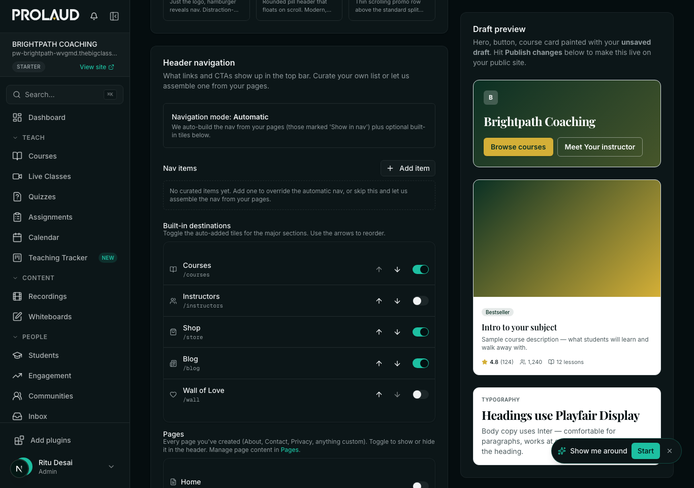
Everything in the top bar of your public site is set in one place. Go to Public Site → Site settings → the Layout tab, and scroll to “Header navigation”.
The two slots
Under “Header CTAs” there are exactly two: a Primary and a Secondary. Each takes the button text and where it goes. The primary renders as a solid, filled button; the secondary as a lighter outlined one beside it.
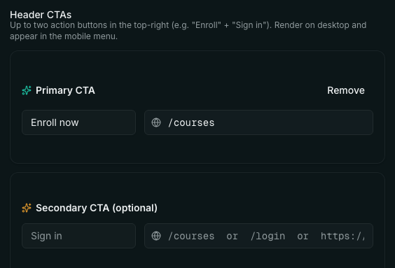
The link can be a page on your own site (“/courses”, “/contact”, “/pricing”), one of the built-in screens (“/login”, “/signup”), or a full address somewhere else (“https://…”, or a “mailto:” or “tel:” link). Paths starting with a slash are pointed at your own site automatically — you never need to type your workspace address into them.
Sign in is already there
Leave the Secondary slot empty and your header is not missing a button. Anyone who is not signed in sees a Sign in button in that position, pointing at your login page. You do not have to add it, and there is nothing to switch on.


How to keep both
If you want a third action as well as Sign in, do not put it in the Secondary slot. You have two better places:
- Add it as an ordinary nav link. In the same card, the list above the CTAs is your menu — add “Book a call → /contact” there. It sits with Courses and Blog rather than as a button, which is usually right for anything that is not the main action.
- Or claim the Secondary slot for Sign in deliberately — button text “Sign in”, link “/login” — and use the Primary for your own action. You end up in the same place as the default, but now it is written down and will not surprise the next person who edits it.
Two behaviors worth knowing
- A signed-in visitor never sees an auth button. Any CTA whose link points at login or signup is hidden once someone signs in, including one you set yourself — it used to appear next to their account menu, which looked broken.
- Someone coming back is shown Sign in first. A visitor who spent more than thirty seconds on your site on an earlier visit gets Sign in as the solid button and your own CTA demoted beside it, on the reasoning that they have probably already enrolled. This only happens while you have left the Secondary slot empty — set one and your choice stands.
On a phone
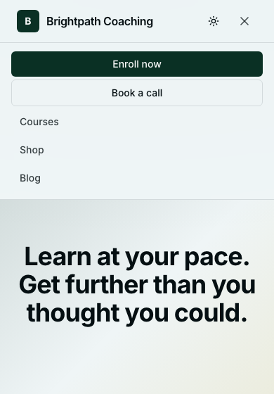
There is no room for buttons beside the logo, so both CTAs move into the menu behind the ☰ icon, below your nav links. Nothing is dropped, but a visitor has to open the menu to reach them — worth remembering if most of your traffic is mobile and your main action is the enroll button.
The links either side of the buttons
The same card controls the menu itself. By default it is assembled for you from any page with “Show in nav” switched on, plus built-in links to Courses, Store, Blog, Instructors and your Wall of Love — each with its own toggle, so you can hide the blog link until you have written something. Switch to a curated list instead and you set the exact links and their order yourself, and new pages stop being added automatically.
- My Sign in button disappeared. What did I do?
- You almost certainly filled in the Secondary CTA. That slot is where the automatic Sign in lives, so your button replaced it. Clear the Secondary CTA with the Remove button and Sign in comes back — or set it to “Sign in → /login” yourself and move your own action to the Primary slot.
- Can I have three buttons?
- No — two is the limit, and it is deliberate: a row of buttons stops reading as a call to action. Anything else belongs in the nav links above them, where it will look like part of the menu rather than a third competing choice.
- I set a CTA but I cannot see it on my site.
- Three things to check, in order. Are you signed in? Buttons pointing at login or signup are hidden for signed-in visitors — try a private window. Did you publish? Header settings go live with everything else on your site. And is the button text filled in? A link with no text has nothing to render.
- Do I have to type my full website address in the link?
- No. Start with a slash — “/courses”, “/contact”, “/login” — and it is pointed at your own site automatically, on your subdomain and on a custom domain alike. Use a full https:// address only for somewhere else entirely, like a booking page on another service.
- Can I link to WhatsApp or a phone number?
- Yes. Put the full link in — “https://wa.me/919800000000” for WhatsApp, or a “tel:” or “mailto:” link — and it opens the way you would expect on a phone.
- Will the button text translate for my multilingual site?
- Yes. The exact text you type here can be translated per language on the Languages page, so “Enroll now” can be shown in Hindi without changing this setting.
Related